Monday, 2 November 2015
Monday, 19 October 2015
Thursday, 15 October 2015
Shape and Form
Shape vs. Form.
Shape is a 2D aspect of of something, so in photography shape is a silhouette or just an object that doesn't have much light to dark contrast. You can also see shape if you have strongly contrasting colours, for example a bright yellow car on a blue background would highlight the shape of the car as well as showing the form.
Form is 3D so any real life object in which you can see detail will have a form, form is shown off by the contrast between light and dark of a photo and the gradient between them. So a rock in sunlight in the middle of a desert , the form of the rock would be clear to see.
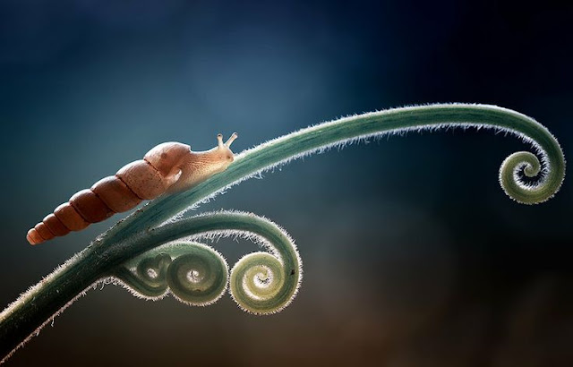
This photo shows form of an object, it shows the plants and snails natural spiral, these spirals follow the Fibonacci sequence. These are natural shapes and are very smooth and flowing as pose to many man made shapes which are geometric. You can also see form in snail and the shell due to the shadows.
This photo is a very good example of shape as it has the silhouette of a bird in it. This is created because the sun is shining from behind the bird into the camera causing a lack of light on the camera side of the bird. this makes it look 2D and makes you focus on the shape.
This photo shows negative shape created by the buildings of a random shape. It also has the form of the actual buildings created be the converging lines and scars of the building.
My Photos
In this picture i tried to capture all the man made geometric shapes on the stairs showing off the form of the building but also make you notice the simple shapes of the pieces.
This photo I took from the top down to give it a 2D effect as much as i possibly could, and made it black and white so as to reduce textures, however i don't think it worked amazingly well. but the table looks like a shape surrounded by the forms of the chairs.
I took this specifically of the bottle with a high contrast to pronounce the shape of it as it is an interesting form. I think the lines of where the angles change really help to show it.
Wednesday, 14 October 2015
Tuesday, 6 October 2015
Space
This photo makes use of lots of space in the form of the water. The cool colours of the water are relaxing and the large amount of space makes a larger point of the red lifebuoy. It adds interest in the buoy, for example why is the pool so empty? What's off to the right? What's all around the water?
This photo has a lot of dead space it in, the dead space behind the plane gives it the effect of going very fast without having motion blur involved in it.
This photo has lots of space in the depth of it with the only focal point being the padlock. The chain is also fairly prominent even though it's out of focus and the whole rest of the photo is using the large aperture to create a feeling of depth.
My Photos
I took this photo as it has space in depth, the scroll of the violin is the focus of the image and the background ground is blurry due to using a large aperture giving the effect of depth.
In this photo I used a lot of empty space, as the subject matter of the photo isn't very dramatic the photo seem quite empty. It makes it seem as if something is missing form the photo and makes you think about what it could be.
This photo has some dead space and some active space, it has more dead space though. The idea space along with the slow shutter speed makes it seem like the dog in the photo is moving very fast.
Monday, 5 October 2015
Subscribe to:
Comments (Atom)


