
Monday, 2 November 2015
Monday, 19 October 2015
Thursday, 15 October 2015
Shape and Form

Shape vs. Form.
Shape is a 2D aspect of of something, so in photography shape is a silhouette or just an object that doesn't have much light to dark contrast. You can also see shape if you have strongly contrasting colours, for example a bright yellow car on a blue background would highlight the shape of the car as well as showing the form.
Form is 3D so any real life object in which you can see detail will have a form, form is shown off by the contrast between light and dark of a photo and the gradient between them. So a rock in sunlight in the middle of a desert , the form of the rock would be clear to see.

This photo shows form of an object, it shows the plants and snails natural spiral, these spirals follow the Fibonacci sequence. These are natural shapes and are very smooth and flowing as pose to many man made shapes which are geometric. You can also see form in snail and the shell due to the shadows.

This photo is a very good example of shape as it has the silhouette of a bird in it. This is created because the sun is shining from behind the bird into the camera causing a lack of light on the camera side of the bird. this makes it look 2D and makes you focus on the shape.

This photo shows negative shape created by the buildings of a random shape. It also has the form of the actual buildings created be the converging lines and scars of the building.
My Photos

In this picture i tried to capture all the man made geometric shapes on the stairs showing off the form of the building but also make you notice the simple shapes of the pieces.

This photo I took from the top down to give it a 2D effect as much as i possibly could, and made it black and white so as to reduce textures, however i don't think it worked amazingly well. but the table looks like a shape surrounded by the forms of the chairs.
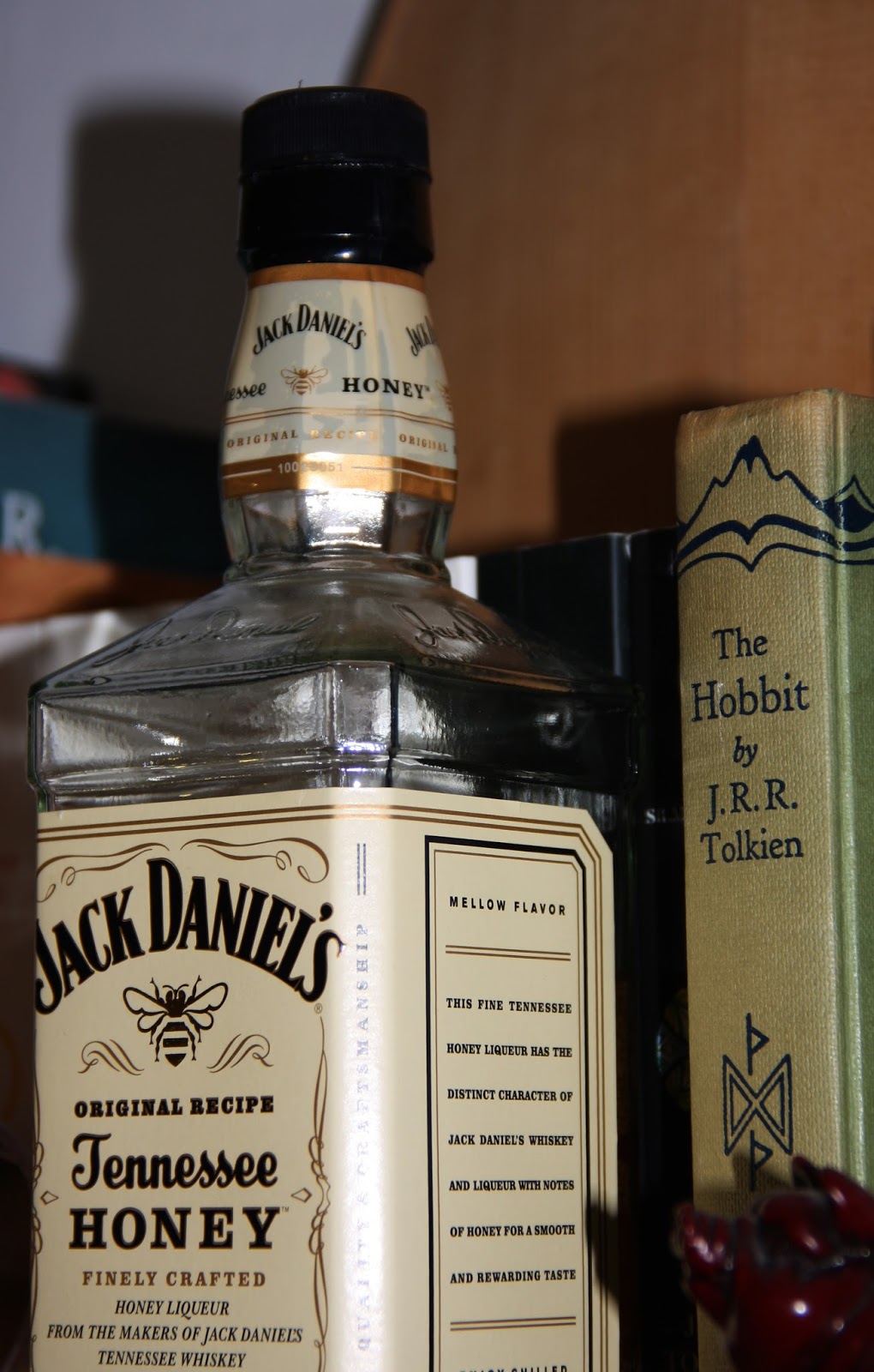
I took this specifically of the bottle with a high contrast to pronounce the shape of it as it is an interesting form. I think the lines of where the angles change really help to show it.
Wednesday, 14 October 2015
Tuesday, 6 October 2015
Space

This photo makes use of lots of space in the form of the water. The cool colours of the water are relaxing and the large amount of space makes a larger point of the red lifebuoy. It adds interest in the buoy, for example why is the pool so empty? What's off to the right? What's all around the water?

This photo has a lot of dead space it in, the dead space behind the plane gives it the effect of going very fast without having motion blur involved in it.

This photo has lots of space in the depth of it with the only focal point being the padlock. The chain is also fairly prominent even though it's out of focus and the whole rest of the photo is using the large aperture to create a feeling of depth.
My Photos

I took this photo as it has space in depth, the scroll of the violin is the focus of the image and the background ground is blurry due to using a large aperture giving the effect of depth.

In this photo I used a lot of empty space, as the subject matter of the photo isn't very dramatic the photo seem quite empty. It makes it seem as if something is missing form the photo and makes you think about what it could be.

This photo has some dead space and some active space, it has more dead space though. The idea space along with the slow shutter speed makes it seem like the dog in the photo is moving very fast.
Monday, 5 October 2015


Tuesday, 29 September 2015
Camera Settings
Shutter Speed
Shutter speed is the length for which the camera's shutter is open. It affects two things, it affects the amount of light let into a picture and how much motion blur there is in the moving parts of the photo. You can change the shutter speed on your camera, using a scroller e.g. see the image below. The shutter speed will appear on the camera speed as a fraction, this is a time in seconds.


This image shows what the Shutter Speed, ISO and Aperture settings will look like on a digital camera screen.

This is an example of a picture taken with slow shutter speed. The slow shutter speed means that the movement of the water looks blurred and fast. This will have been taken with a small aperture (Large aperture value) and/or a lower ISO value so that the image doesn't get over exposed.

This photo was taken with a very high shutter speed, the high speed means that you can see a bubble that is part way through bursting. It was also taken with a large aperture (Small aperture value) to keep the photo from being dark, you can this because the back ground is blurry.
Aperture
Aperture is the size of the hole in the lens that allows light into the sensor of the camera. It affects the exposure of a picture and the how are the depth of field is. Aperture is measured in f stops, the bigger the f stop (e.g.f22) is the smaller the aperture is. It also affects the depth of field so as the aperture increases the depth of field decreases.


This is an example of a photo with a large aperture, this means it allows lot of light it but the depth of field is very small which leads to the background being very out of focus.

In this photo, a small aperture is used. This means that the depth of field is large so everything in the photo is in focus, also the photo will be darker except that a slower shutter speed and higher ISO will cancel this out.
ISO
ISO is how sensitive your camera is to light. The lowest ISO number will be the highest quality photo your camera can take and if the ISO number is too high it can make your photo grainy or noisy. The higher ISO you use, the lower the light conditions can be without having to use a flash. Every camera has a 'base ISO' and this is the ISO you should aim to use when possible as it will lead to the best quality photographs, the base is often 100 or 200. An ISO of 400 is double the sensitivity of ISO 200 and therefore needs half to the time to capture.


This is an example of a photo with a high ISO, as you can see the picture has become grainy.
Monday, 28 September 2015
Saturday, 26 September 2015
Colour

This photo uses vibrant colours that are complementary, the red and the blue bing at opposite sides of the colour wheel. Most of the photo is blue, giving the photo a cool and relaxed sort of feeling with the red lifebuoy making a striking impact. The lifebuoy seems quite saturated and rich, which contrasts with paler blue. The photo also uses space very well.

This photo was shot in colour but then made to be black and white except for a few of the leaves that the colour was left in. This is to emphasise the new growth of the young leaves against the old trees of the wood. The green is very bright in contrast to the complete lack of colour of the rest of the photo.

This photo also has good use of complementary colours, from the yellowy-orange to the bright blue of the sky. The sky and the sign seem very saturated in comparison to the land which seems more washed out and duller. The sign really stands out of the photo because it's surrounded by the blue.
My Photos

For this photo, In photoshop I made all of the background black and white, whilst leaving the cyclist in full colour. This draws attention to the cyclist and away from the background, making it seem like he's coming right at you out of the picture. It shows that the background is not the focus point and of no interest.

This photo has lots of blues, yellows and greens making it analogous, however the colours are quite saturated so it still looks quite colourful in a way. All the cool colours make it feel very relaxed as well.

In this photo I made use of complementary colours from the red-orange of the flowers to the green of the leaves and grass around it. The hotter colours are vibrant and exciting bringing the attention to them.
Tuesday, 22 September 2015
Lines

The lines are of the tree trunks and the shadows cast by the sun. These shadows are converging towards the left third of the photograph, bringing the focus to the sun.

The groyne in this photo makes a diagonal line disappearing off into the sea, it leads to something unknown something for your imagination. Also the horizontal line created by the sea, makes it seem peaceful and relaxing.

The bridge in this picture creates a horizontal line approximately halfway up the photo. As horizontal lines suggest stability and strength, this represents the purpose of a bridge quite well.
My Photos

I took this photo as it has many lines converging on to one point. The lines all come from housing to the one telegraph pole, making it a vital part of the photo and creates a metaphor for how dependant we are on the internet.

This photo has a horizontal line across of the border of the field and then the path and telephone wires leading off to the same place. This draws your attention to it, who knows whats at the end of the path.

I took this photo as your eyes follow the road down a curved line to the junction. It then looks like it could continue up the hill or off to the left or right.
Monday, 21 September 2015

Subscribe to:
Comments (Atom)